![]() When I started systematically measuring website usability over 10 years ago I started with the SUS as a key metric.
When I started systematically measuring website usability over 10 years ago I started with the SUS as a key metric.
The System Usability Scale (SUS) was the natural questionnaire to start with. It was then, as it is now, a popular 10-item questionnaire to measure the perceived usability of interfaces.
It’s been around for over 30 years and because of the wording of the items it can and has been applied to just about any “system,” including consumer and business software, websites, mobile apps, and Interactive Voice Response systems. It’s wide usage also means there are plenty of SUS benchmarks to compare a SUS score to—making the raw score more meaningful.
However, after observing enough website interactions and hearing the problems and concerns participants had, it became clear that the website user experience was more than just the narrow construct of usability addressed by the SUS.
Usability is of course a critical part of the website user experience. If participants can’t complete their goals on a website, they can quickly find an alternative. But I needed a questionnaire to address the broader attitudes that affect the quality of the website user experience while keeping it to as few items as possible. The result is the Standardized User Experience Percentile Rank-Questionnaire (SUPR-Q), an 8-item psychometrically validated questionnaire to measure the quality of the website user experience. Here are four major reasons we use and recommend the SUPR-Q to measure the website user experience.
The SUPR-Q Measures More than Usability
Measuring the user experience of websites is more than just asking about perceptions of usability. Users that don’t trust a website (the brand, the information, the payment system, how their data is used) tend not to purchase, return, or recommend. What’s more, the appearance of the website also affects attitudes towards the brand and even attitudes toward usability itself. The SUPR-Q captures these sentiments of trust and appearance in separate factors, which helps you understand how these factors affect purchase intent and likelihood to return and recommend.
A Normalized Score is More Meaningful
One of the main advantages of using the SUPR-Q is that it has a normalized (also called standardized) reference database of 150 websites: the S in SUPR-Q stands for Standardized. This normalized database shows how a raw SUPR-Q score compares to others for both the overall score and the sub-factors of usability, appearance, trust, and loyalty. The scores in the database are updated quarterly and include some of the most common websites to provide familiar reference points to stakeholders. Maintaining regular updates means the SUPR-Q database isn’t free like the SUS but the timely and relevant benchmarks we think justify that cost.
While the SUS has a reference database (I helped put it together), its 500 scores include a mix of physical products and software, and not just websites—making the benchmark less relevant. The best benchmarks are those that are tailored specifically for the domain or type of interface. It’s for that reason we’ve been testing adaptations of the SUPR-Q for the mobile app user experience (called the SUPR-Qm), which will be published later this year.
You Get More with Fewer Items
Not only does the SUPR-Q measure more than the SUS, it does so with fewer items. Participants’ time is scarce. We need participants to spend as much time interacting with interfaces and less time answering redundant items. While some redundancy is good in a questionnaire, there is a diminishing return. When developing the SUPR-Q we winnowed down the items to just two essential items for each factor (8 overall). Two items are the minimum number you need to analyze the factor structure using factor analysis.
The SUS’s 10 items were intended to measure only the single construct of usability. And it does this well. In both its original research and follow-up research, the SUS, despite being shorter than other questionnaires (like the SUMI and PSSUQ), was found to be reliable (consistent responses) and valid (usable products had higher SUS scores than unusable products). But even at 10 items, there’s a fair amount of redundancy and an opportunity to reduce the number of items.
There is a price, albeit a small one, to pay for using fewer items for both usability and the user experience. The overall SUPR-Q score and usability scores tend to have slightly lower reliability scores than the SUS (.86 and .88 respectively). The SUS typically has a Cronbach alpha of around .90 to .91. But the slight reduction in reliability is a small price to pay for needing only 20% of the items when measuring perceived usability and measuring more constructs with fewer items.
You Can Predict SUS Scores from the SUPR-Q
But wait, there’s more! While it may sound like a TV infomercial, using the SUPR-Q means you don’t have to choose! You can actually get a SUS score when using the SUPR-Q. The 2-item usability factor on the SUPR-Q can predict SUS scores quite accurately because they are highly correlated (r=.87). We wanted to retain as much continuity to existing SUS data so when we created the SUPR-Q we ensured the usability factor correlated highly.
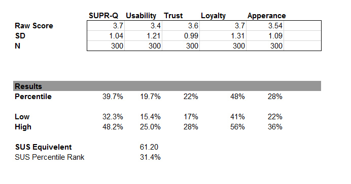
Figure 1: Screenshot showing conversion of a SUPR-Q usability score to a SUS equivalent score.
For example, we collected SUPR-Q data on 10 retail websites and Amazon had a usability score in the 98th percentile (better than 98% of websites). That SUPR-Q score has a SUS equivalent score of 85. A SUS score of 85 places Amazon in the 97th percentile relative to 500 other interfaces, showing the two items on the SUPR-Q have strong agreement with the 10-item SUS.
In the same study, Best Buy and Nordstrom had SUS equivalent scores of 77, derived from SUPR-Q usability scores at the 72nd percentile (also showing the close agreement). The difference in percentile ranks reflects the different reference databases—the SUS scores are compared to all types of products whereas the SUPR-Q scores are compared to only websites. The linkage between the SUS and SUPRQ allows teams to easily transition from the SUS to the SUPR-Q as I did years ago.
Summary
There’s no reason to ditch the SUS, but when measuring the website user experience, the SUPR-Q is likely a better alternative. The SUPR-Q’s 8 items are designed to measure the perception of the overall website user experience and it has some advantages over the SUS. With fewer items, you get more than a measure of usability, you also get measures of trust, appearance, and loyalty that are backed by a normalized database of websites. Despite having fewer items, there is only a modest reduction in reliability. Finally, you can actually still predict SUS scores with the SUPR-Q, making it an ideal measure of the website user experience.


