 Who are the users and what are they trying to do?
Answering those two questions are essential first steps to measuring and improving the right things on an interface. It’s also one of the first things we’ll cover at the Denver UX Boot Camp.
While there are hundreds to thousands of things users can accomplish on websites and software interfaces, there are a critical few tasks that drive users to visit a website or use the software.
Think of all the features Microsoft Word provides. It supports document editing, mail merging, desktop publishing and a full range of HTML. By one estimate, it has around 1200 features . Now think of the most important features that you need when you create or edit a document—the features you couldn’t live without? These features likely support your top-tasks.
Prioritizing tasks is not a new concept. Having users rank what’s important is a technique that’s been used extensively in marketing and conjoint analysis. But having users force-rank hundreds or thousands of features individually would be too tedious for even the most diligent of users (or even the most sophisticated, choice-based conjoint).
Gerry McGovern proposed a unique way of having users consider a lot of features in his book The Stranger’s Long Neck. I was a bit skeptical when I read it a few years ago, but decided to try it. Since then, I’ve used his method of top-task ranking for a number of projects successfully. Here’s how it works.
List the Tasks
In the users’ language, identify features, content and functionality you want them to consider. Avoid internal jargon as much as possible and have it at a level of granularity that is both actionable and that the user can relate to. The tasks can be specific to a website or to a class of websites.
For example, here are a few things you can do on a healthcare insurance company website:
- Look up the address of a doctor.
- Find the office hours of a doctor.
- See if a healthcare provider accepts your insurance.
Pick Five
Present the enumerated list of tasks in randomized order to representative users. Have these users pick only five out of the list. A screenshot of what this looks like is shown below.
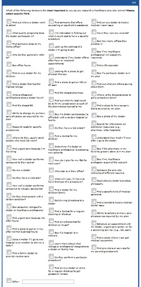
As Gerry explains and as we’ve seen, there will usually be too many tasks for users to consider individually. What happens is the users will scan the tasks and look for key words that are top-of-mind. This is why it is essential to have the list randomized, so tasks have an equal chance of being near the top or bottom of the list, as order matters.
There’s nothing sacred about picking five, it’s just a good number that works when you have something like 50 or more tasks. When we have had fewer tasks, say 20 to 30, we adjust the number down to three for users to select. This ensures users are forced to pick the really important tasks from the nice-to-haves.
Graph & Analyze
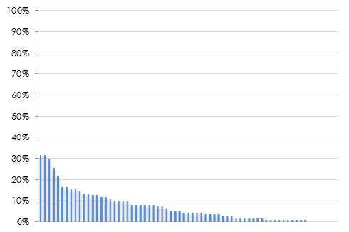
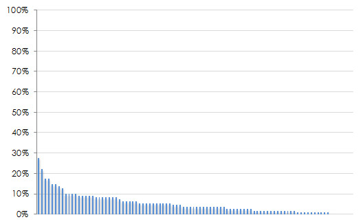
Count up the votes each task received and divide that by the total number of users that voted. Sort them in descending order and express it as a percentage. The characteristic shape of the top-task graph is the “long neck” of the vital few tasks you users care about (hence the title of Gerry’s book). Four examples are shown below. Notice the handful of tasks which really stand out near the left side of each graph? These are the top tasks.
|
 |
 |
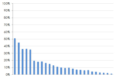 |
Figure 2: Four examples of top tasks results with different industries and numbers of tasks. From the upper left going clock wise: Automotive information (94 tasks), health insurance websites (69 tasks), consumer electronic device features (26 tasks), the National Multiple Sclerosis Website (66 tasks).
You’ll also see the long tail of the trivial tasks that are less important. Of course, you can’t just stop supporting your less important tasks, but you should be sure those top tasks can be completed effectively and efficiently. They should become the core tasks you conduct benchmark tests around and the basis for design efforts.
We also add confidence intervals around many of our top-tasks graphs to help readers understand the margin of error around each item. This way, if there are strong opinions about how important or trivial a task is, one or two votes in general won’t matter statistically. The graph below shows a larger version of the graph from the lower right quadrant above with 90% confidence intervals. The gap after the fifth task (and the non-overlap in the confidence intervals) provides a good breaking point for prioritization. This particular top-task study was around what features consumers look for when researching consumer electronic devices on their smartphone.
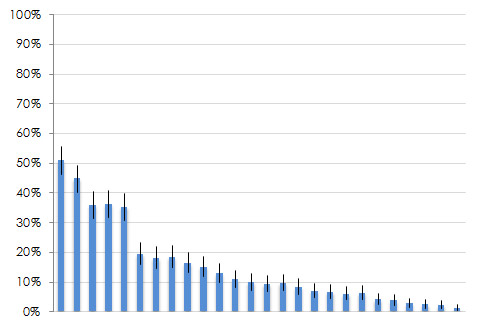
Figure 3: Top tasks results with confidence intervals. You can see the gap between the confidence intervals after the fifth task which shows a clear breaking point.
Different Ways of Calculating Top Tasks
There are actually a few ways to calculate and present top-tasks percentages. In his book, Gerry will often graph the sum of total votes per item. This approach really accentuates the long neck. Using the sum instead of percentage, though, prevents us from building reliable confidence intervals and conducting statistical tests so we use the proportion of votes.
There are two ways to express votes as a percentage. The first is the one mentioned above—number of votes for each item, divided by total users. This approach allows us to have confidence intervals that are around people (statistical independence) and not around votes (statistical dependence).
The second approach is to take the total number of votes for each item divided by the total votes. For example, if you have 100 participants picking their top five tasks, you will have 500 total votes. If one item gets 40 votes, you can present this as 8% of total votes (40/500). This would be compared to 40% of users that picked the item (40/100).
What you present depends on both what you find easier to communicate and what’s easier for your stakeholders to interpret. Fortunately, all three methods will generate the same ordering of top-tasks.
Sample Size
One common question for conducting top-tasks, as with most user-research methods is what sample size is needed. The answer comes down to the level of precision you need around each item. Each item has an associated percentage of votes which we build a confidence interval around. The table below shows the sample size you’d need to have a desired margin of error (plus or minus around each percentage).
| Sample Size | Margin of Error (+/-) |
| 1689 | 2% |
| 749 | 3% |
| 421 | 4% |
| 268 | 5% |
| 186 | 6% |
| 136 | 7% |
| 103 | 8% |
| 81 | 9% |
| 65 | 10% |
Table 1: Sample size for proportions used for top tasks analysis (90% confidence and assumes percentages of 50%–a conservative estimate).
For example, to achieve a margin of error of approximately 7%, you should plan on a sample size of around 136. This percentage is based on the assumption that the percentage will fall at around 50% at a 90% level of confidence. In top-tasks analysis, most items will actually only be selected by a small percentage of users, making the sample sizes shown above on the high side for most of the items.
However, there are cases where a few items get a similarly high percentage (e.g. 40% and 50%), and we when we need a cut off, having more precise confidence intervals help. The bottom line is to use the numbers above for planning as a worst-case scenario and know many of the items will have margins of error less than or equal to the values.
Quick and Effective
A top-task analysis is relatively easy to set up and quick to administer and analyze using any survey software. Just be sure you can randomize the tasks to users. We’ve collected data using intercepts on websites, from panel providers who recruit a targeted group, and from customer lists.
We’ve also had internal stakeholders take the same top-task study as customers and mapped up where users and stakeholders agreed or disagreed. Gerry does a good job in his book detailing how to go from user goals to top-tasks, as well as giving advice for dealing with all sorts of organizational constraints.
Before starting any redesign and beginning prioritizing efforts, conduct a top-task analysis to be sure you’re working on what users are really trying to accomplish!


