 What affects customer loyalty more? Price, features, or usability?
What are the key drivers of brand attitude?
A key driver analysis (KDA) allows you to identify what features or aspects have the biggest impact on an outcome variable such as likelihood to recommend, brand attitudes, and UX quality.
It’s one of the more powerful techniques we use to help prioritize findings in surveys.
Here are 10 things to know about this powerful technique.
- A key driver analysis tells you the relative importance of predictor (independent) variables on your outcome (dependent) variable. For example, a KDA can tell you which has a higher impact on customers’ likelihood to recommend: the price, quality, or usability. These are expressed using standardized values called beta weights (see #5).
- Multiple linear regression is the most common technique to compute a KDA. Multiple linear regression analysis is one of the “workhorses” of multivariate analysis, and is supported by most statistics packages (e.g., SPSS, R, Minitab, SAS). It works by examining the correlations between independent variables to generate the best linear combination to predict the outcome variable. It provides a model “fit” using R-squared, which tells you how well the independent variables predict the dependent variable. For example, an R-squared value of .50 means the independent variables explain 50% of the variance in the dependent variable.
- A key driver analysis can use continuous and categorical predictors. Continuous variables, such as rating scale data, can be combined with binary data (e.g., yes/no, purchase/didn’t purchase) to come up with the right combination of variables to predict an outcome variable.
- Many variables correlate with each other, but in a multiple regression analysis the “key” drivers are those variables that contribute additional information on top of the other variables. These variables are retained, while redundant variables are removed. Using just a simple correlation will exaggerate the strength of the relationship between variables because the inter-correlations aren’t accounted for. If the correlations are too high between independent variables, an undesirable condition called multi-collinearity is created, which reduces the reliability of the beta weights and model-fit. This can be managed by removing highly correlating independent variables.
- The importance of a variable is derived using standardized beta weights. Beta weights describe how much the outcome variable moves (in standard deviations) based on the change in the predictor variable. For example, in a KDA we conducted for a web application company to understand the impact on likelihood to recommend, attitudes toward the usability of the product had a beta weight of .55 compared to attitudes with its stability (beta weight of .12). This is interpreted by saying a one standard deviation change in usability scores will increase the likelihood to recommend scores by .55 standard deviations. In contrast, a one standard deviation change in stability satisfaction scores will increase likelihood to recommend scores by only .12 standard deviations. In this data, attitudes toward usability are a more important driver of customer loyalty than product stability.
- One way to visualize a key driver analysis is a 2×2 matrix. This visualization allows you to see two data points: the impact or importance of a particular variable; and the frequency or intensity of the dependent variable, as seen in the example below. For example, the beta weight (.55) and score of usability (76% of maximum score) can be seen in the upper-left quadrant of the KDA chart. The importance (beta weight) of stability (.12) and its score (78% of maximum score) can be seen in the lower-left quadrant of the KDA chart.
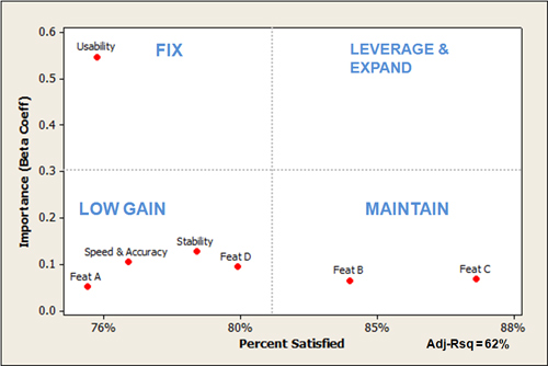
- The x-axis of KDA charts is based on the independent variables and are scaled relatively. If your measures use different scales (e.g., 11-point, 7-point, or binary), you’ll need to convert them all to the same scale for interpretability. For the example above, we converted different raw scale scores into a percentage of the maximum score. Notice also the Adj-Rsq of 62% label in the chart, which indicates these variables predict 62% of likelihood to recommend scores (which is quite good, as we see this value range from 20% to 70%).
- Like other 2×2 matrices, a key driver analysis chart helps you weigh two aspects simultaneously (importance and intensity in this case). The quadrant labels are based on the context to help interpret values in each quadrant. For example, the upper-left quadrant shows aspects that are important but relatively low in satisfaction, which suggests improving them would likely improve overall product satisfaction—hence the name “Fix.” The upper-right quadrant shows values that are both high in importance and high in satisfaction (none appear in the example above) that we refer to as “Leverage and Expand” as it is where you want most variables to be (like the Gartner magic quadrant). The low gain quadrant shows features that are scoring low, but are relatively low in importance (suggesting a lower benefit in addressing them). The Maintain quadrant shows high scoring features with relatively low importance suggesting attention might be better elsewhere.
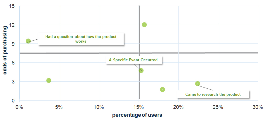
- Binary outcome variables use logistic regression. For binary outcome variables (for example, purchase/not purchase a product), we need to use a different statistical approach. Using multiple logistic regression provides the same relative weights of the variables; it just uses the logit transformation and odds ratios (and can consequently be a bit harder to interpret than a multiple linear regression analysis). The example below shows the odds of people purchasing a product based on their reasons for coming to a website. The odds a website visitor will purchase the product if they came because of a specific product question are three times as high as customers who came only to research the product. This data was collected using our website intercept survey.
- Another potential technique to employ is Shapley Value Regression. One of the weaknesses of multiple linear regression is that the importance (beta weights) tend to be overly reliant on the sample data and thus not stable predictors of future data. Shapley Value Regression is based on game theory, and tends to improve the stability of the estimates from sample to sample. Despite this shortcoming with multiple linear regression analysis, it still identifies the major variables (key drivers) even if the relative importance is less stable. Most importantly, its relative ease of computation and rich history make it the go-to procedure for identifying key drivers.


