 Few things affect task success more than the navigation of website. If users can’t find what they’re looking for, not much else matters. If it were easy to get the navigation right, there wouldn’t be books and a profession dedicated to it.
First impressions matter in life and that’s also the case with website navigation. Research has shown that when users’ first click is down the right path, 87% eventually succeed. When they click down an incorrect path, only 46% eventually succeed.
Getting the navigation right usually takes a few tries and some testing with users. You can test first clicks with a functioning website, a prototype or just a boxy-wireframe. Here’s how I measure that important first click:
- Create a few task-scenarios just like you would for a usability test. They don’t need to be as detailed, but I prefer to have the participant thinking in terms of solving a problem rather than just where to click.
- Define the optimal and any correct paths to task success: Start from the homepage and identify all (or at least most) of the possible paths that will get to a correct solution for the task.
- Track where users click: This easiest thing to do is use software like MUIQ or Chalkmark which use JavaScript to track all mouse clicks. The software generates a very compelling heatmap you can use in presentations. You can also track this by hand, but I’d recommend at least recording each session.
- Time how long it takes users to make that click: Task time is one of the most sensitive metrics. Users may be finding the right spot during the evaluation (because you’re observing them or they’re getting paid) but both long task times and high task variability are indicative of problems in the navigation (see Figure 1 below).
- How confident were they? After each task attempt, I uses a 7 point scale and have participants indicate how confident they were they found the right location. While I get quite a few 6’s and 7’s (indicating high confidence) a few 3’s and 4’s inevitably occur and they are the signposts of navigation problems.
- How difficult was it?: Maybe the participants found the right location in the navigation but let them tell you if they thought it was harder than they expected. Again I use a single 7 point rating scale. If users rate anything less than a 5, I ask them to tell elaborate on why they chose the rating. The open ended comments usually provide insight into mental models and ideas for improvements.
- Compared to what ?: I’m usually working with a client to redesign an existing website. Nothing quite puts the numbers in context like showing how long it’s taking users or how difficult users are finding the tasks relative to the original navigation. I have the users attempt the same tasks on the new design and old design. The order is counterbalanced so half the users get the old site first and half get the new. I’m then able to show which tasks are taking longer or which ones are an improvement. The same idea can be applied to any metric that’s collected. The graph below shows an example from a recent evaluation.
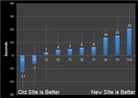
Figure 1: Mean difference in first click times and 80% confidence intervals between and old and new navigation.
With just 13 users we were able to identify three tasks which were already statistically faster, several which were about the same and three which were either statistically slower or had very high variability (as seen by the widths of the confidence intervals). While there is clearly room for improvement in the next design iteration, the results were encouraging considering the users were already very familiar with the existing site structure.


