 At our company, we collect and examine a lot of data from various studies: usability tests, branding studies, customer-segmentation analyses, and so on.
While you always can’t control the quality of the responses, or the questions asked to participants, you can make the most with the data you receive by using these six techniques the next time you analyze data.
1. Discard bad data first
To determine the quality of your data, first look for data from cheaters and speeders. Finding and removing suspect data early will save a lot of rework later.
Cheaters pay little or no attention to the survey questions; they look for a pattern in your first few questions and then respond to all questions with a corresponding pattern. Include a “cheater-catching” (pattern-breaking) question here and there in your survey to expose those who fail to pay even a modicum of attention to the questions. Throw out the data from cheaters.
Speeders finish the survey far more quickly than anyone else. For example, they spend only a few seconds on a usability task that takes much longer to complete, or they finish a thirty-question survey in a few minutes. Throw out the data from speeders.
For another quality check, examine the responses to open-ended questions. Gibberish or repeated terse answers usually indicate low-quality data; throw that data out.
Finally, track which participants you exclude and why you excluded them since sometimes you’ll want to go back and re-include participants if your exclusion criteria were too strict.
2. Understand the impact of missing data
Ideally, each participant answers each question with a high-quality response. In fact, missing data is inevitable. So determine, for each participant, whether holes in the data seem random, or have a pattern.
If the missing responses seem systematic to certain types of respondents, the results could be unexpectedly biased. Techniques exist for filling in missing data: imputing values, using the mean, using regression analysis, or using values determined from other responses. But this is the subject for another blog (and some books).
3. Collapse variables
You might ask participants about their experience with a website or product using multiple categories. You might ask about attitudes or satisfaction on, say, a seven-point or eleven-point scale. We often collapse experience or satisfaction scores into a dichotomous variable of low and high scores when we use it as an independent variable.
While it’s good to have a lot of fidelity in a score, especially when it’s used as a dependent variable, by dichotomizing you can more easily cross-tab and run statistical comparisons between the lower and higher ends of an independent variable. For example, if you have five experience levels describing how often participants visited a website in the last year, you may have options such as Never, 1-3 times, 4-6 times, 7-9 times, or 10+ times. You can collapse these levels into low frequency (never to 1-3 times) and high frequency (4+ times) as shown in Figure 1.
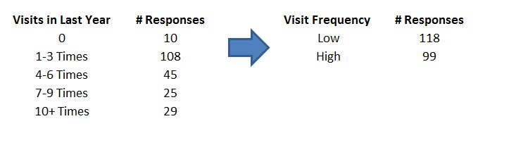
Figure 1: Participants’ responses to the number of visits to a website get recoded into two options, making the results easier to analyze as an independent variable.
Set your break points to yield a reasonably balanced group–you typically don’t want 95% of your responses in high experience and 5% in low experience.
4. Create composite variables
When you measure participants’ attitudes toward a brand, product, or experience, you usually pose several questions—satisfaction levels, brand pillars, or perceptions of usability. Responses often correlate highly with each other (r >= .6). The reliability of a combined set of questions is higher than any individual question, so we look for opportunities to combine related questions into a composite variable. We do so usually by averaging the responses and using this new average to draw inferences about the customer population.
For example, when a participant rates how much he or she agrees or disagrees with brand attributes such as Convenient, On my side, Available, Simple, Easy, and Fast, responses will tend to correlate with each other. That is, the same participant will rate all of them similarly high, low, or in the middle. We can then average these responses and create a new composite variable, say Brand Attitude–and use it for additional analysis.
5. Use confidence intervals
Any sample of customer data contains errors when making inferences about the larger customer population. While one services to minimizing the effects of sampling error is to collect a large sample size, you can easily compute confidence intervals and visualize them in Excel, enabling you to make the most of small and large sample sizes.
A confidence interval, as illustrated in Figure 2, provides the most plausible range of the response average. It tells you the upper and lower boundary that an average score would fluctuate between if you could measure every single customer (such as to a rating scale or binary response option).
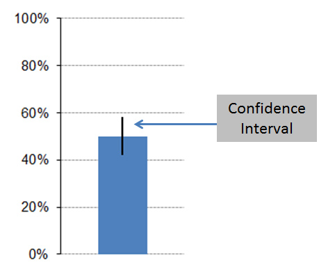
Figure 2: Visualization of a confidence interval computed in Excel.
6. Examine distributions, not just averages
The mean tells you about the middle or typical value, and the standard deviation describes the variability. It’s also helpful to see how the data is distributed using a frequency distribution (for discrete data) and a dot-plot (for continuous data). Figure 3 shows two distributions of responses on a seven point scale. Even though both have almost the same number of responses (103 and 107), notice the larger spike for the darker blue bars at the response options of 1 and 2. This suggests that a substantial minority of respondents were dissatisfied, an insight that may have been masked if you looked only at the average response.
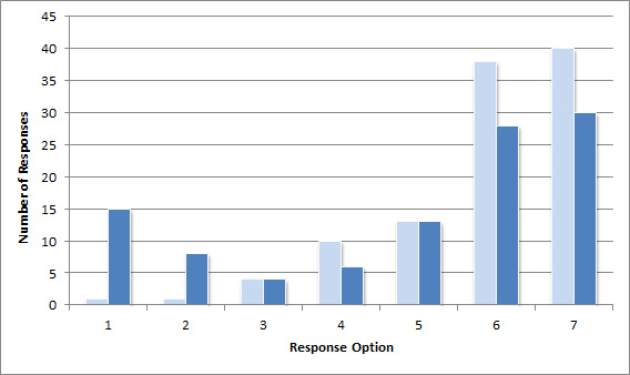
Figure 3: Frequency distribution of responses on a seven-point scale, where option 1 indicates “very dissatisfied” and option 7 indicates “very satisfied.” The dark-blue bars show a much larger number of dissatisfied (1’s and 2’s) than the light blue bars.
Figure 4 below is a dot-plot of salaries for professionals in the User Experience field. While most salaries cluster under $150k, a handful show up above half-a-million dollars. This suggests a few professionals are doing quite well or that there were errors in data entry from this self-reported response in a survey to UX professionals (probably more likely).

Figure 4: Distribution of salaries reported by User Experience professionals.
Both frequency distributions and dot plots reveal any unusual response patterns–such as a large group of unsatisfied users or–in the case of income, revenue, reaction time, or task-time data–outlying data that affect the mean and standard deviation and require additional steps to properly analyze.
If you want to get more from your data, try using these six techniques on your next analysis.


